Today’s chosen theme: Minimalist Color Palettes for Eco-Friendly Living. Welcome to a calm, resource-wise way of styling your home where fewer hues mean fewer toxins, longer-lasting choices, and a softer footprint. Explore gentle tones, honest materials, and mindful decisions—and join our community to share your palette ideas and sustainable wins.
Why Color Simplicity Supports Sustainability
Keeping to a concise palette often means fewer tint shots, lower pigment loads, and a higher likelihood you will pick low-VOC or natural paints. That translates into less off-gassing, fewer headaches, and better indoor air quality. Share your favorite low-VOC brands in the comments and help others breathe easier.
Why Color Simplicity Supports Sustainability
Lighter, neutral walls with high light reflectance values bounce daylight deeper into rooms, reducing the need for task lighting. You will notice earlier evenings without switching on lamps and mornings that feel brighter. Try tracking lamp hours for a week, then tell us how your neutral walls changed your routine.
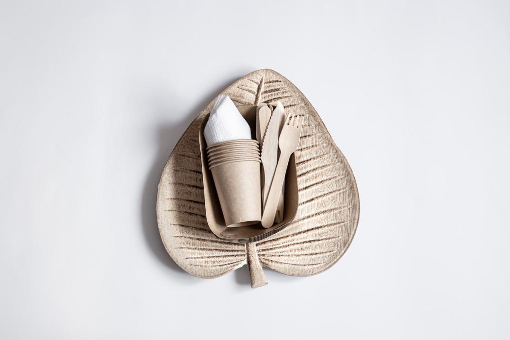
Building a Conscious Palette
Low-VOC, plant-based, mineral tints
Consider limewash, clay, or casein paints tinted with mineral pigments. Their velvety depth reads sophisticated, not sterile, and their chemistry supports healthier interiors. If you have used mineral paints, drop a tip about coverage and curing time to help newcomers navigate the learning curve sustainably.
Timeless over trendy
Choose enduring shades—chalk, oat, mushroom, stone, or soft graphite—over fast fad colors. Timeless hues reduce repaint frequency and keep furnishings relevant longer. Which long-lived neutral anchors your space? Share a photo or a hex code to inspire readers building their forever palette today.
Local materials, local hues
Let your region’s landscape guide the palette: dune beige, river clay, fog gray, or pine-bark brown. Local inspiration fosters authentic, place-based design and reduces shipping for finishes. Tell us which local textures or colors shaped your home and how they echo your surroundings throughout the seasons.
Living room: warm neutrals that invite conversation
Think ecru walls, mushroom trim, and a single charcoal accent on shelving. Add recycled wool throws and undyed cushions to build softness without color noise. What proportion of light to dark works in your living room? Comment with your ratio and why it supports connection and comfort.
Kitchen: clean contrasts for clarity
Soft white cabinets, matte black hardware, and pale gray backsplash tiles keep prep areas bright and calm. Bamboo or recycled paper composite counters ground the look. Do you cook better with lighter surfaces? Share your experience and whether neutrals help you keep ingredients organized and visible.
Bedroom: restorative twilight tones
Layer fog gray walls with dusty sage linens and natural wood bedside tables. Use organic cotton drapery to soften early light without heavy dyes. What shades help you unwind fastest at night? Tell us how your minimalist palette influences better sleep and a gentler morning routine.
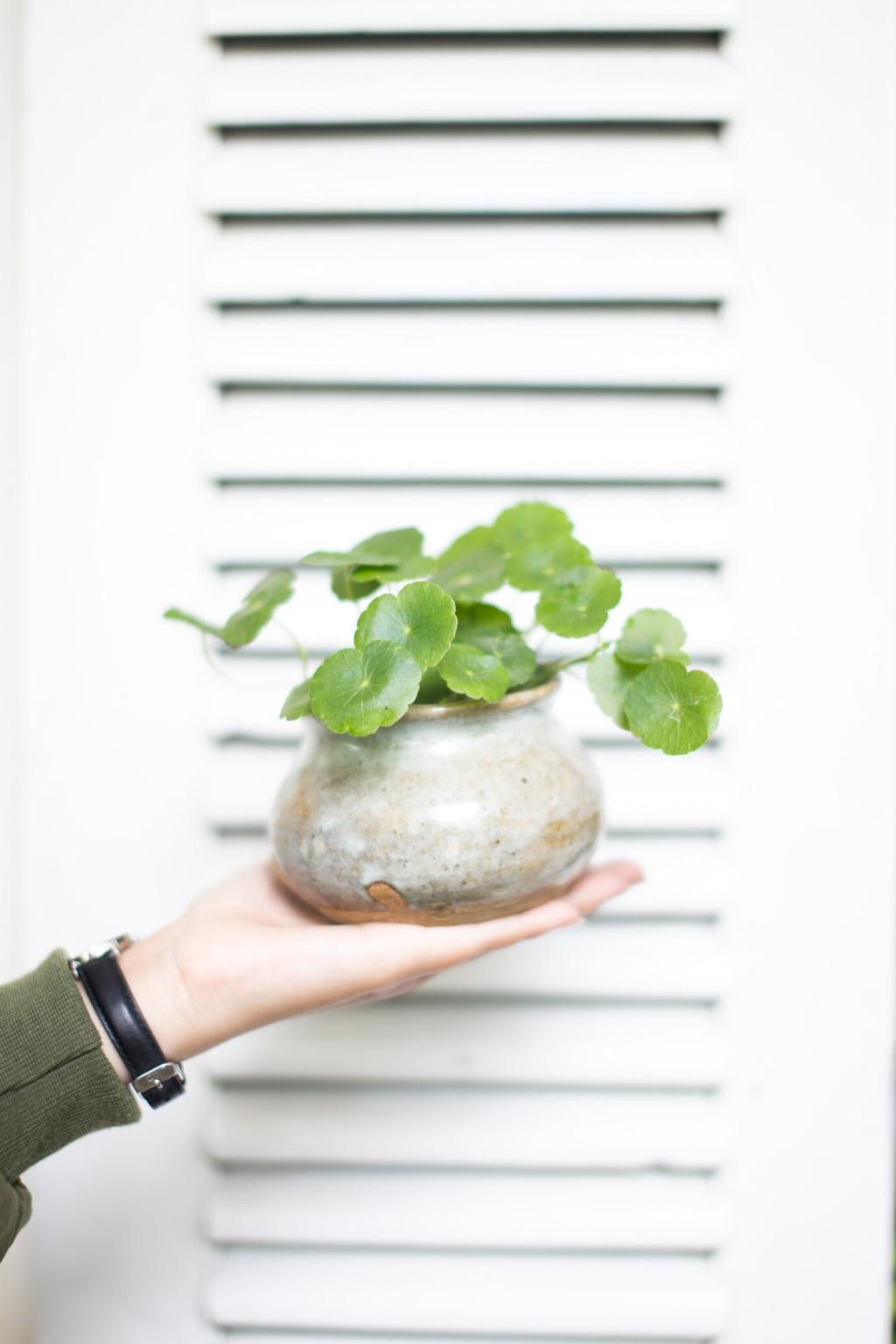
Textures and Finishes that Respect the Palette
GOTS-certified cotton, flax linen, and undyed wool offer breathable comfort in gentle, forgiving shades. They patina gracefully instead of aging out. Which fabric lasts longest in your home? Share laundering tips that preserve color subtlety and reduce water and energy use over time.
Textures and Finishes that Respect the Palette
Reclaimed oak, ash, or elm in honey or driftwood tones adds character without dominating the room. Plant-based oils enrich grain while keeping finishes breathable. Show us a reclaimed piece you love and explain how its tone complements your palette without demanding constant attention.
Borrow, trade, rotate
Organize a neighborhood swap for undyed textiles, neutral vases, or wood trays. A shared library of accents keeps spending low and variety high. Would you join a local swap? Invite friends in the comments and suggest a small item everyone can contribute each season.
Botanical dye experiments
Refresh existing linens with natural dyes from avocado pits, onion skins, or black tea for gentle blushes and earthy tans. Test swatches first for washfastness. Have you tried a botanical dye bath? Share your recipe, results, and what surprised you about achieving subtle, palette-friendly tones.
Make the most of what you have
Rearrange furniture to chase daylight, rotate rugs, and swap cushion covers between rooms. These free moves maintain novelty within a stable palette. Which no-cost change made the biggest impact for you? Tell us how a simple rearrangement clarified your colors and improved the room’s flow.
Story: The Apartment That Breathed Again
The entry wall shouted teal, the kitchen flashed crimson, and three different finishes battled in the bedroom. Paint cans lingered, and the sharp odor never fully left. If this sounds familiar, tell us where color clashes made you feel restless at home.
Comment with your base neutral, secondary neutral, and accent. Include brand, finish, and any low-VOC or mineral credentials. Your combination could help someone reduce repainting and waste while achieving a calmer home.
02
Join our email list for bite-size, sustainable tasks—swatch tests, daylight audits, and texture trials. We send practical prompts that respect your time and budget. Subscribe today and share which challenge you want first.
03
Post a photo of your minimalist palette in action and tag it so others can learn. Show how you layered textures, saved resources, or reused existing pieces. We will feature thoughtful examples to inspire low-impact transformation.